The Genius Design of Dutch Money
1.69M ยอดวิว1778 คำคัดลอกข้อความแชร์
Hoog
Head to https://www.squarespace.com/hoog to save 10% off your first purchase of a website or domain ...
บทถอดความวิดีโอ:
part of this video was sponsored by Squarespace this is the Kilda it was the Dutch currency for hundreds of years then it disappeared this was a shame not the Euro but the death of the design its colors outdid every dollar its Lighthouse stood above all buildings and its portraits embarrassed the queen some say even killed her the Kilda changed the face of cash forever I believe it's the best paper money ever made but why why was Dutch money so different why does it look so [Music] strange Ocha oar was different he designed government issued stamps
with dramatic playful colors then he used brand new techniques like computer generated Graphics to create complicated geometrical patterns in the' 60s he made the air flatters a series of five portrait banknotes from the vundle rider Hulse a painter sink a composer the router a naval commander and of course Spinosa together they all look kind of odd oar's faces look more like they belong in a comic than on a bank note Dutch notes are very distinctive they are unlike any other central banks notes that I'm aware of visually very strong King I could imagine that not
everybody likes them when you think of money you think of value a medium for you to exchange one thing for another but money is also branding there millions of tiny Billboards spread across an entire country it's a place where a Nation shows what it stands for a canvas to display national heroes and icons so why do oakar feel like he's making a joke the notes had to have portraits on them of famous historical figures which would not create any political problems portraits are the most used images on currency and they can be a bit touchy
for some a nation is nothing more than the sum of its people we use portraits to hold some up as lessons and inspiration for others though portraits can lift up people whose value system is out of date maybe even threatening statues intentional or not can be monuments colonizers slave owners and authoritarians maybe the same could be said of the faces we put on currency should Andrew Jackson a president and also slave owner be replaced by Harriet Tubman a slave emancipator should we avoid figures entirely The Genius of oar's designs is that it didn't matter he
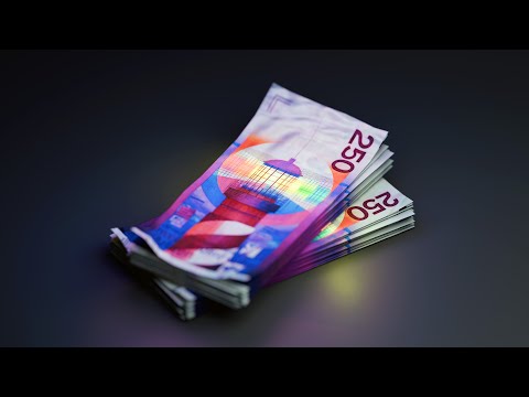
neither avoided people entirely or kept them he caricatured them this is George Washington yeah president and this is mikil dout I mean okay if you live in a country whose banknotes scream take me seriously keeping or removing a portrait will always be a controversy if you have Bank notes that play the fool well then there's not much of a throne to fight over the air flatters changed portrait currency but it's oen our second series that turned it on its head he was asked to replace the 100 Kilda and add a 50 and 250 bank note
for the 100 he replaces the naval Commander not with someone else but with a bird this was crazy a snipe doesn't have ties to citizenship it's a bird found in marshy land that happens to be in the Netherlands but it is by no means the Netherlands for hundreds of years money was intimately tied to the faces of rulers Earth changing scientists and artists henar played a joke on them all he made the whole H Kilda the first bank note in the Western World to no longer be a portrait just a bird with the 50 Kilda
bank note he changed it up again he proposes a sunflower another object with no clear ties to a nation but still an indirect homage to B the glue had made the bee fall off from the top onto the flower as though it flew there the 50 Mark is horizontal some of its text is vertical this temps the owner to turn the bill around you hand the cashier not money but a flower finally there's the lighthouse oar's last and probably most beautiful bank note hello where am I why hello there you're in a Squarespace ad what
is this who are you Squarespace is the best website builder on the Market it's the 21st century you need a personal website what are you even talking H that's actually a fair point with squarespace's flexible website templates and its new fluid engine it's never been easier for anyone to unlock unbreakable creativity when it comes to designing your own website launch a business and use squares spaces analytics to build a marketing strategy so you can make more money launch a Blog and use squarespace's blogging tools to share your stories photos videos and updates check out squarespace.com
for a free trial and when you're ready to launch go to squarespace.com slh to save 10% off your first purchase of a website or domain Oar wanted to make currency that symbolized the Netherlands without being a cliche no windmills clogs cows or tulips instead of projecting what the Dutch are loudly Oaken are intentionally chose symbols that were a bit more normal he then took it a step further by converting these symbols into security features Bank notes need to be secured against forgery that's why banks will issue paper money with watermarks so the bills are harder
to copy oakar also designed watermarks but they were different instead of heads or Angels Oar chose animals for the 100 The Watermark is the head of a snipe on the flower it's a bee and on the lighthouse a dune [Music] rabbit you can look through the note and you see a a watermark that is a rabbit it was a rabbit belonging to my girlfriend everybody has to walk around with my rabbit in their pocket I like that on theill and on the sposa are fingerprints I put something personal into this my fingerprint in the hair
of one of the world's most important philosophers Spinosa very Unholy of me not very nice the smudge of a finger is so sloppy that no serious artist would dare to include it oakar did it Anyway by the time that the Dutch National Bank realized what they were it was too late a joke in the pockets of an entire population that is the nice part of making bank notes you can make monuments by the millions he did the same for the lighthouse in the beacon he hid three women's names his granddaughter girlfriend and friend the engraver
had included these names also completely unknown to the Dutch National Bank the combination of security features and oar's personal humor was a reoccurring theme the smallest lettering that you see in that white square well this is meant so that when you are sitting somewhere in a private place like the toilet or somewhere like that you have something to read another counterfeiting technique is microprinting banks will put tiny design printed features onto a bank note this makes it difficult for counterfeits to reprint it accurately with a standard photocopying machine this can be done by printing small
lines of text but that's kind of boring it's a security feature that's just kind of slapped on to the design the artist comes along hands over his sketches his ideas and then they tell him the design had to be changed that's our job we are responsible for security it's one way of doing it treating a bank note design and its security feature as separate jobs but there is also another way you make the security features an integral part of the design I said I have to have unrestricted access to every detail to every technique to
every secret otherwise I cannot make a good design I must know what the techniques are the bank accepted this you can add a bunch of small thin lines because it makes the bank note secure or you can add a bunch of small thin lines because it's necessary for it to look good for the 100 250 and 50 Kilda each had their own simple primitive in the background where you could find hundreds of micr lines changing and adjusting to different areas in a grid were these necessary for the design or for the security the beauty is
that you can't tell I chose very Elementary colors because it was a small series of only five values instead of single colors or muted ones Oar f for vibrant Reds Blues yellows and greens when I made my first bank note the printers maintained that more color was an impossibility they said when you use a green it must be very dark and blackish green otherwise it's not safe I discovered that this was not true I just had to keep on asking and asking oar's Bank notes did not only stand out next to single colored Bank notes
but they also stood Out Among the colored ones it's almost as though oar's banknotes were like Monopoly money which is well exactly what they were the only money I had seen which was as clear as I wanted money to B was Monopoly money that was nice money in my eyes so I hope that my own work looks a little bit like that you don't need to look at the number on Monopoly money to recognize its value the design is clear the layout standardized and the topography loud with the Hilda it was the same at a
moment's notice the faintest Glimpse you could identify exactly which bank note it was the specific colors that were chosen were almost nearly perfect the primary colors blue red and yellow are the most visually clear for the human eye oakar believe the notes which were used the most should also reflect that when the value of the money was higher only then would you find the secondary colors a dignified green or a royal Violet if you're color blind you're probably not getting this video but you could also still determine the Hilda's value from large legible letters the
objective was to use very clear typography so that when you folded up the note you could see what the value of the bank note was at least four times oar's designs were influential for the Euro they didn't consider using separate colors until the Dutch National Bank submitted a proposal based on his designs he changed the rules for what a bank note could and should look like it the Deep In by I think that Sy
วิดีโอที่เกี่ยวข้อง
33:03
Why Some Designs Are Impossible to Improve...
Design Theory
2,408,266 views
17:44
Why Swiss Money Looks Weird
IMPERIAL
856,658 views

9:44
How Banks Magically Create Money
Primal Space
1,142,866 views

18:35
What's Inside the World's Most Secret Church
Hoog
1,147,952 views

47:01
The Unbreakable Kryptos Code
LEMMiNO
6,740,938 views

32:03
The Tokyo Subway Attack
Hoog
2,482,327 views

17:03
Capitalism Is Over: What's Next Is Worse
Wisecrack
851,197 views
20:57
The Battle for Central Park
Hoog
1,005,410 views

26:24
How North Korea Makes Elite Hackers
Cybernews
321,173 views

9:17
How This Pen Changed The World
Primal Space
2,778,080 views
23:37
The Most Damaging Mole in the CIA
Newsthink
302,899 views
15:39
Why the American Lawn sucks
Hoog
1,559,427 views
14:05
The Cube Actually Begins Construction
MegaBuilds
865,228 views
15:46
How Amsterdam Built A Dystopia
Hoog
3,084,376 views

20:55
The Insane Design of Soviet Nukes
fern
2,290,667 views

14:04
How America Got So Good At Buying Sh*t
How Money Works
239,059 views

27:44
How many plants do you need to breathe? T...
Joel Creates
4,514,165 views
5:56
How Disney Legally Issued its Own Currency...
Half as Interesting
1,535,593 views
26:55
10 Companies That Secretly Control The World
The Infographics Show
254,885 views

24:55
Tipping: Last Week Tonight with John Olive...
LastWeekTonight
1,207,259 views