7. Mastering Layout | FlutterFlow University Expert Training
3.36k views10743 WordsCopy TextShare
FlutterFlow
Welcome back to FlutterFlow University! In this module, we dive into mastering layouts, providing es...
Video Transcript:
Layout arranges UI elements on the screen to create a visually appealing and functional interface. Therefore, understanding layouts is important because a structured layout enhances user experience, ensures content is easy to navigate, and makes the app responsive across various devices and screen sizes. Let's first have a quick review of what we have discussed about layout in module 6 to refresh our knowledge. To start with building layouts with widgets in FlutterFlow we should understand atomic design. We've seen how this structured approach plays out in FlutterFlow, from the simplest elements to creating a fully fledged interface, which leads
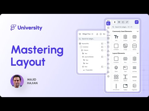
to creating Pages. For example, in an e-commerce app, the user can land on the product list page after login. Then we have seen how creating these widgets in atomic design and their parent-child relationship can generate widget tree. The widget tree in FlutterFlow visually helps you identify the widgets you like to work with, and demonstrates how the layout is structured. This was a quick knowledge touch, but we will go deeper in the upcoming videos on how you can build different layouts in FlutterFlow. Let's see what you will learn in this module. First we're going to talk
about Pages. We're going to deep dive into the different part of Pages and how you can manage Pages, create and modify them. Then we're going to go through the different types of widget in FlutterFlow, and how you can even control the different properties of these widgets to build your layout. Then we're actually going to build a layout with what we have learned about Pages and widgets, and then you will see how you can even create a responsive layout that works across mobile, tablets and a desktop version of your application. And finally, we will review what
we have done in this module in the generated code. Let's get started on this exciting journey to mastering layouts in now. Without further ado, let's get started. Let's go a bit deeper into Pages first. In FlutterFlow, you build a Page layout using widgets. Each Page you create is fundamentally structured using a Scaffold widget, which is a widget from Flutter that offers a consistent framework for each Page and allows you to define and organize its structure. Typically, you find the Scaffold with the name of the Page, for example ProfileSettingsPage in this example, at the top of
the widget tree. Scaffold allows you to include easily an App Bar, a widget that displays a toolbar at the top of the screen, which is typically used for branding, navigation, and actions related to the current screen. A Floating Action Button or FAB, which is a button commonly used for primary screen actions, such as adding a new contact or composing a message, or inviting a friend. A body is the main content area where you place your widgets for the body of the Page. In FlutterFlow, you won't find a section explicitly labeled as body. For example, in
the ProfileSettings Page, the Column serves as the root of the widget tree for the body, with the rest of the child widgets assembled underneath. We will work with the Column widget in this module. Stay tuned. There is also the Drawer, which is a slide out menu that can emerge from either side of the screen. It is typically used for app navigation or placing additional options. It allows user to switch between different sections of an app without cluttering the main interface. Essentially, you can use a Drawer and EndDrawer widget from FlutterFlow's pre-built widgets to create a
Drawer for your Page. There's one more thing you usually see in many apps and Pages. NavBar. The NavBar or navigation bar allows you quickly navigate between Pages of your app. It is displayed at the bottom of the screen for convenient access. The items inside the nav bar are represented by icons, optional text, or both. You can display up to 3 or 5 primary or top level Pages, Pages accessible from anywhere in your app. Inside the nav bar. By default, the nav bar is disabled for any project created in FlutterFlow, but can be enabled if needed.
We will do that in this video. All right. We have seen how a Page is structured. Now let's see what is a Page life cycle. There are essentially four key moments in their life cycle of a Page. Let's get through each of them one by one. Initialization is the first phase where the Page is set up. During this phase, the initial data is loaded, which might involve setting up the necessary state or defaults for the Page. Then you go to the next phase: rendering. In this phase, the Page is actually drawn or rendered on the
screen. This includes setting up the layout styles and any interactive elements. The user can now see the Page in its initial state. Then you go to the updating phase. After rendering, the Page becomes interactive and can respond to user inputs such as clicks, taps, typing, or other gestures. It may re-render parts of the Page or the entire Page to reflect changes due to interaction or new data. And the final phase is going to be: disposal. When the Page is no longer needed or the user navigates away, Then this phase is going to be triggered. Here,
resources related to the Page are released from the memory and are no longer accessible in FlutterFlow. Most of the lifecycle stages are handled internally by FlutterFlow's architecture. However, some methods are exposed so that you as a developer can decide what additional configurations to load upon initialization and when to re-render the UI based on the interactions. All right. Next let's talk about Page properties. In FlutterFlow, follow the properties panel located on the right side. Next let's talk about Page properties. We have seen the properties panel in FlutterFlow's App Builder dashboard. This panel is divided into several
sections, each dedicated to different settings and adjustments you can make to customize your Page. The Page Parameters section allows you to define and manage parameters that your Page can receive from other Pages. Parameters are essentially data that can be accessed. But you may ask what is parameter? Parameters are essentially data that can be passed between Pages. For example, you might pass a user ID from a list Page to a detail Page to display a specific information about that user. Next is routing in FlutterFlow. Route settings are essential for defining how Pages within your applications are
accessed and interacted with. These settings allow you to customize the URL path for web and mobile deep linking. Set meaningful Page names as unique identifiers. Integrate dynamic parameters into your routes and set access restrictions based on user authentication. In module 12, when we will learn about routing and navigation in FlutterFlow, we will learn about parameters and how you can use them with routes. Next are specific Page settings. The properties panel offers configuration settings for more advanced customization and functionalities within your FlutterFlow project. These settings allow appearance modification, greater interactivity, dynamic data handling, and more tailored
user experience. And lastly, there are NavBar settings, especially for the parent Page. I mentioned that you can enable the NavBar from settings, which we will be enabled for all Pages, but you can also control and manage the NavBar settings on each Page separately. All right. You've learned now the fundamentals of Pages in FlutterFlow, and how you can work with Pages. What is the life cycle and the properties that you may need to modify? Nothing will beat a demo. Let's start creating Pages in a quick demo. All right. I'm back to my app builder. And on
the right side, I have a profile setting Page, which I created as well. So this Page as we have seen has App Bar. So here is the app. Let me actually create three Pages here. First thing first. I already created Part-1 branch and I'm doing everything from now in part one. So you're going to have the main as a starter. And then the part one is going to be everything we're creating right now. What I'm going to do right now, I'm going to go and create a folder. We've seen how we can create a folder.
I'm just going to go and create a new folder called Profile. Everything related to profile, We put under this folder. I'm going to add a new blank Page. We already have seen that you can create also from the predefined templates or with generative AI. But I'm going to create a blank one for now. And I will name it Profile Settings Page. Let's also create another Page under another folder. Let's call it Orders. And I'm going to create Order List Page as well. So now we have three Pages. Let's work on the Profile Settings. So in
module 5 we've seen that you can define your theme settings - the colors, typography and the design system. I'm not going to go with design system. You can do that by all means. You can do that. But for this demo we're just going to set the colors directly. I already have got the colors from my designer, so I just put it into my light mode and the dark mode so everything is ready. Then I'm going to go to the Typography And Icons, and I will just select Rubik as my primary font, as my designer said,
and the secondary font to Roboto. All right. Everything is pretty much ready. So now let's go and create our Pages. So the first thing you will see is actually the AppBar here. I'm going to change the title to "Profile" for now. And as you can see I can select the app bar. Let me open the widget tree. And here is what you can see the AppBar. So on the right side you can change the background color to any other color. I'm just going to open this background color and select the secondary background color. All right.
And for elevation which is this shadow I'm going to select zero to just look like what I have. Another thing is the background of my Page. And as you can see when I select the Page the scaffold the background color is appearing here, which is at the moment Primary color. I'm just going to remove that and I can select secondary background to match my AppBar. So now I'm going to select the AppBar again. And this time I can actually select the AppBar setting. And you will see I have different styles. And the one that is
looking like that design is very similar to the one that I have here. So I'm just going to select and quickly make sure that the properties are matching that design. So my text Page in this case... So as you can see my text is also white. If I select the Text now I can go to the properties. And then I have the text color. So I can change this to become like potentially primary text or primary. I'm going to select the primary text to look better in my design. And then you see when I change
the AppBar setting style, I now also have an icon button where I need to go to the properties settings and find a color in this case, to make sure that is matching my design. So this is the fill color, which I don't want. Or maybe we just need the icon color. And here is the icon color which I can select the primary text. All right that's good. There's one more icon in my design like an Edit icon which I don't have right now in App Bar. And that's in the location of Actions in App Bar.
How can you do that? For example, you can have an icon button. If you drag and drop, you'll see that in your app bar you have a leading, title and action section. If you just drop it to the action sections, that's where you get these icon buttons. And now you can go and set the properties to make sure it's matching that design. So then another thing I want to enable is actually the NavBar. And as you can see I have this setting here. And I can say "Show the NavBar on this Page". If you want
the NavBar to be enabled on all Pages, you can go to the Nav settings from here or click on this setting icon and go to the Nav Bar and App Bar. Here is the setting of Navigation Bar and App Bar, where you can set it for the entire application. For example, if I enable Nav Bar right now, it says "Nav Bar requires at least two Pages". We're going to fix that quickly, but as you can see, I also have the app enabled on new Pages. If your design doesn't require an App Bar on different Pages,
you can disable this. So if your App Bar is going to look like one of these, you can select each and then define so that you don't need to repeat this on each Page that you are creating. But the good thing is that, like the one that we see right now, you may need to override the default setting in some Pages, which we've done for Profile Setting at the moment. And one more thing. When we enable the Nav Bar from settings, you see that there is an error popping up in the project issues and it
says Nav Bar requires at least two Pages. So I'm going to go and enable two Pages for the Nav Bar. So I'm going to start from this Page. And still I get the error. I'm going to go back to Home Page and also enable it on Home Page. And voila. Now I have two icons. So I'm going to also do this on the Order Page. So now we have three. So if I go back now to this setting you will see. Now this time my settings for Nav Bar is a bit different. So I can
reorder these Pages. For example I can say the Order list Page goes to the middle and Profile Setting to the last one. And there's one more thing here is the style. The default style. So you can select the Flutter default style. Or you can select the Google or the Floating one. It's just up to you. I'm just going to go for the default for now, but you can do whatever you want in your project that suits your design. So let's go ahead and actually set up the Nav Bar icons. So now this time if I
go back to the Page, as you can see, the navigation bar Item Properties is appearing here. And I can set the properties. For example I'm going to change the icon in this case to a user icon. Or I go to the List Page and change it to a list icon. You can do that also by clicking on this Nav Bar settings in the canvas area. And you can also play around with different options. For example, if you want a different active icon. For example, if you hover over it, you'll want a different user icon. You
can do that to. All right. Looks good. There's one more thing we want to do based on the design. And that's the FAB icon, "Invite friend". And that's what you can do from visual palette. Go to the visual palette and search for the Floating Action Button. And you will see that you will receive the FAB icon. You just need to drag and drop it to your Page and that will appear on the Floating Action Button area. And now you can go and actually set the properties that you would like. For example, you can go to
the FAB properties and select the different icons. Or as the design requires, you know, set up an icon. We need a text. If I go to my FAB and select, you'll see that in my widget tree I have an icon for my FAB. So I'm just going to delete this and instead go to Widget Palette. Search for Text and then drag and drop it to the FAB icon. There you go. Now if you go to Widget Tree again, you'll see that you have a Floating Action Button plus a Text where you can define your text
properties on the right side. For example, changing the font, color, and the text for this button. Let's also fix the color. It seems like it's not primary. In fact, it's a different color. And there you go. Now it's very similar to that design. And one more thing because we talked about the Drawer as well. Now I can go back to Home Page and this time I can go to the widget palette and search for Drawer. And you can see that I have Drawer and EndDrawer So I'm going to select the Drawer in this case to
my Page. And you see, that is appearing on top of the Page. And if I go to the widget tree the Drawer is now part of the Scaffold. And you can hide or open it. That was it. Let's go ahead and test out what we have built. I'm just going to click on Preview. All right. We're landing on the Home Page. I'm going to go to the Profile Setting Page. And voila I have my Profile Setting Page. You can even test the dark mode and light mode. You see if it's dark mode and light mode,
everything works as expected. All right, that's it. That was all about Scaffolding a Page: AppBar, NavBar, Drawer and FAB. And in the next video, we're going to talk a lot about widgets and how we can build the body of our application. FlutterFlow has the following categories of widgets: Layout, Base, Page and Form, which can be accessed from the widget palette. Let's start with layout elements. These widgets help organize the structure and layout of your app. They determine how other widgets are arranged and displayed on the screen. Then, the base elements: based elements are the fundamental
building blocks for creating the visual and interactive elements of your app. In FlutterFlow, the Page Elements category is essential for structuring pages and facilitating navigations throughout the app. Finally, Form elements. Form elements are features specifically used for creating forms where users can enter data. The widget properties vary from widget to widget, but there are a few properties that are usually common between widgets. Visibility is one of the common properties among widgets, starting with Conditional. Conditional visibility allows you to control the display of UI elements or widgets based on a certain condition or criteria. First, you
need to select the widget from widget Tree or the Canvas area, then move to the properties panel and enable the condition. Then you can click on Unset and provide the condition that determines whether a UI element should be displayed or hidden. Also, keep in mind you can toggle Show in UI builder to test the effect of showing/ hiding that feature in the UI builder. This section provides guidance on adjusting these shared attributes across different screens and devices. We will learn about this in this module in the responsive video. Controlling the opacity of any widget opens
up many creative opportunities. It accepts value between 0 and 1. For example, zero means full transparency. One is opaque. Let's start with padding. Padding is an empty space around the outer side of the widget. Next is to adjust Alignment. This property helps you position the widget in two ways. Horizontal and vertical alignment, where the widget will be placed horizontally and vertically inside its parent. The testing property enables you to specify the value key for the current widget, which serves as a reference point during automated test runs. All right, I'm back to my App Builder dashboard,
and when I go to the View palette, you'll see that I have four categories. Let me just go through them one by one. Drag and drop the text to the body of your page, and you'll see that you have the Text selected. Properties appear on the right side. For example, you can change the text in this case. So I'm just going to say Hello Friends. Let's go ahead and define the paddings. And as you can see you have two options: either independent or uniforms. When you select the uniform the whatever number you give it actually
applies both vertically and horizontally. You go and check the independent, you can actually just do from one side that you are looking for, or maybe give different numbers based on the design that you have. Let's do the alignment here. In this case there are multiple options. So you have this visual where you can just select and it will apply the alignment automatically. Or you can manually do that. Say here in this case minus one. And I can just say one. And it will just select what it's supposed to do. There are also properties that are
just as specific for this feature. For example Text property as you can see. And if I select an Image property you don't see this option. So the Text property comes with multiple options such as styling, fonts and weight, size, color spacing, line height, text alignment, maximum lines, and so on and so forth. So many options that you can play around based on your design. All right. Now that we have done the text, let's do another one. Let's do actually icon. Now you have an icon here. And the property panel now shows again that some of
the common ones such as visibility, the conditional, the Padding as you can see, and specifically the icon properties, like you can change the icon based on what you like, the size and the color. Let's go and do one more thing CircleImage probably. So this is also an interesting one. Again, you can just see that you have in the panel properties common properties such as visibility, padding testing. And then you get to the specific widget properties. You can also play around with the image type whether this is going to be network, which means this is going
to load from internet or it's an asset - we're going to work with that. You can upload an image right away and just have it bundled with your application and show it here, or it's already uploaded and you can just select it. All right. So I'm just going to fall back to my network as it shows. Let's try another widget. So this time I'm going to go to the Page widget. We already worked with AppBar, Fab and Drawer and EndDrawer So I'm not going to repeat that again. And we're going to go through the Form.
There are multiple options here: TextField. So I'm just going to drag and drop here what it's going to give you a text field where people can type. Or DropDown where you can select multiple options. And as you can see again you're going to have on the properties panel, some of the properties that are common. And then the ones that are specifically for this widget, including for DropDown, define options. And I have option one, 2 or 3 whatever. So I can add more. But let's go back to the Layout elements. So the layout element also comes
with several widgets including Container, Row and Column. Container is one of the most interesting ones. It can come in rectangular or circle and you can have the container properties. I'm going to now open the page that we were supposed to create. So imagine now we had this really cool image on the right side. We're going to create that here. But how can we do that. So we learned that we have a Circle Image. So I'm going to just search for "circle image". And I will drag and drop it here. So with the alignment I just
make it in the center. As you can see if I look at the properties there is no border. But I have a border here. How can I make that happen? And that's where the Container comes in place. I'm going to search for "container" and then drag and drop it here. Now I'm going to open the widget tree and you'll see that I have container and circle image. I'm just going to have this circle image move to the Container. Because Container can accept a child. So then now after moving that, my Container is going to have
a child which is going to be CircleImage. So what will happen now? I'm going to go to Container right now. Make it centered. And what it happens is I can go and make my container a circle. Then I can give it a border. And I can even define the border widths. I'll change the diameter to a bit bigger - fine - just to be more visible. And as you can see in the design, we have a little bit of space between the border and the image. And that looks like I need to go to my
child so I can just go to this and define a little bit of Padding. There you go. Now I'm going to go back to my Container and I'm going to show you one more thing here. So for example you can change the fill color. Let's say you can change it to secondary. And this time because the container background is actually a different color, you see this is appearing. So that was just a quick demo of different widgets and how you can play around. But without any hesitation. Let's go to the next video. So far, you
learned how a Page plays a role in creating the layout. We also touched the surface for using different widgets and widget properties. It's time to talk about the layout of the main section of the app: the body. When you start building a layout, one of the most common layout patterns is arranging widgets vertically or horizontally. You can use Row widgets to create horizontal arrangement of widgets. A Row widget can have several children or widgets. Essentially, row widget has two axes, the main axis and the cross axis, which defines how the child elements should be laid
out. In FlutterFlow, Row has several properties to configure. Let's understand them. Main Axis Size is about how much is space should be occupied in the main axis. You have two options: use minimum or maximum. The main axis alignment is about how the child elements should be laid out. Start means place child elements as close to the beginning as possible. Center it means: place child elements as close to the middle as possible, and it does the same to the End. Space Evenly, evenly spaces child elements. Space Around, which places the free space evenly between the child
elements, with some extra space at the beginning at an end, and a Space Between which place the free space evenly between the child elements. All right, that might be a little bit hard to understand. Let me simplify that for you. Take a look at this example. So this is what when we are talking about the main axis alignment. Imagine you have three elements in a Row. And that's how the main axis alignment is going to work in a Row. When you select each of these options just take a look at the Space Between or Center
or Start. Let's also talk about cross axis. So cross axis is about how the child elements should be aligned vertically with several options. Start, Center and Stretch. Stretch makes children feel that cross axis vertically. All right so let me simplify that again for you. Here is how it looks like. This is how FlutterFlow allows you to set Row cross axis properties. You can typically use Column widget to create a vertical alignment. But that was about the Row. How about Column? How about if you want to set an arrangement vertically? You can typically use Column widgets
to create a vertical arrangement of widgets. A Column can also have several children or widgets. Like a Row, A Column also has two axis, the main axis and the cross axis. In FlutterFlow. Column also has several properties to configure. They're fairly similar to Rows, so that's why. Let's just take a look at the visualization of these options. Again the main axis runs vertically. Child widgets are laid out from top to bottom. This is how FlutterFlow allows you to set Columns main axis properties. You also have similar options to Row, but their arrangement is going to
be vertical. Also, the cross axis runs horizontally. It controls how child widgets align from left to right within the Column. You also have several options such as a Start, Center, and End, but in the context of a Column. So when you understand one of them, it's going to be easy to understand the rest, of course. Let's talk about another option as Scrollable for Columns and Rows. This option determines whether the content within these layouts can extend beyond the visible boundaries of the screens or Containers, enabling horizontal or vertical scrolling. You have two options. Allow a
scroll where, when enabled, this allows the content to exceed that device or parent container the screen limit, making the overflow content accessible through a scrolling. If you select do not allow a scrolling, it disables these options. This setting forces that content to fit within the available visible space, hiding overflow content or potentially causing layout issues. We're going to see that in a demo. Don't worry, stay tuned! And finally, let's talk about spacing for Columns and Rows. There are a few options. Item spacing sets the space between each child widget within the Row or Column. Apply
to start and end: applies the specified item spacing to the beginning and the end of the Row and Column. This effectively adds padding at the start and the end of the layout. In addition to between the items, Start Spacing and End Spacing allow for additional specific spacing at the start and end of the Row and Column, respectively. This is useful for fine tuning the layout to ensure content is visually balanced with the container, or to provide a clear margin. All right, but there's one more thing. When we talk about Row and Column it's important to
understand: As you can see, we can even use a Row IN the Column as one of the widgets. We can call this way composing widgets: a fundamental aspect of creating layouts in FlutterFlow. That means you can combine different widgets to form a cohesive and functional all user interface. You can have a Column where the children are Row, and a Row can have a children of Columns, and so on and so forth. Though when widgets are placed inside a Row and Column in a layout, they gain access to an additional property called Expansion and Flex. Okay,
we need to learn this and see it visually, and we're going to see that also in the demo. This property controls how a widget behaves by occupying available space within its parent Row or Column. Well let's talk about expansion properties: Default, which makes the widget not fill a space along the main axis. And when we're talking about main axis, it means horizontal for Row, vertical for Column, as we have seen. Therefore, the minimum space required by its content. Flexible allows widgets to take up to the available space along the main axis. You can think of
it giving it a max widths equal to amount of available space. The widget can take up less space if it is smaller, but otherwise will be constrained to the available widths. Expanded makes the widget fill the space along the main axis. So here are two examples, as you can see. You can see two examples right now in this screen. Additionally, you can utilize Flex factors to determine the flexibility of a widget within its parent container. A flex factor is an integer assigned to a child widget, indicating its proportional size compared to other children in the
same parent. When you assign a flex factor, the widget can expand to feel any available space in the parent container. For instance, in a Row or Column, if one widget has a flex factor of one and another has a flex factor of two, the second widget will take up twice as much space as the first one. All right. Don't worry, I get you. That's why we're going to have a demo at the end of this video. And we're going to go through all of this with a quick demo. But before that, let me just tell
you one more concept, which is very important. Sometimes you need to place a widget on top of another to create such a layout. You can use the Stack widget. Stack widgets will make a layer of widgets on top of each other. For example, Stack can be helpful when we want to add a Favorite button icon at the top of a product page. The concept of main and cross axis is less applicable to Stack, because widgets are aligned relative to the entire Stack area. In FlutterFlow, you can control the Stack children's alignment using the Stack property
default child alignment, which positions the chart children using X and Y coordinates. Now that we have seen the different arrangements of widgets like Column, Row, and Stack, let's see how you can start building a layout. This step is crucial when you are just starting to build an app. Before adding widgets to that page. Sketch a picture of how the main layout will divided into smaller pieces. It's very important that you can identify these small pieces and group them together. Next, identify the widgets that can replace those section such as Column, Row, and Stack. Once you
have a clear idea of which widgets to use, you can add them. The next step is to examine these smaller sections carefully and if necessary, divide them into further smaller sections and replace them with appropriate widgets. You can repeat this process until you achieve what you are looking for. To design your application. All right, that's enough of the concept. Let's go to the app builder and start building our layout. All right, I'm back to my app builder dashboard. So if you look at these designs right now so I can identify that the main section in
this design can be a Column. So I already added a Column and I can see it in my widget tree. So the next section is going to be this section where I have an image name and an email. This looks like a Column. So I'm just going to go and find another Column and drag and drop to the Column that I have. We want to start with a CircleImage and in fact is going to be a Container. Inside a container we're going to have a CircleImage. All right. And then I'm going to have a text.
And and I need another text. So I'm just gonna drag and drop to the Column. Let's go back to the widget tree. And this time if you look at this right now I have my Column. Here is my page Column. Here is my Column at the top. But this text and text that I pasted is not actually under the Column that I created on the top. So I'm just going to drag and drop this under this. All right. That's good. So let's now quickly create this UI. Another thing that I see is actually this one.
Again this looks like one, two three, four Rows because each of them Has one icon, one text and one icon here. So this is going to look like a a Row. And all of them are in a Column. So then I need another Column. If I go back to widget tree right now then I have two Columns. In the second Column, I need a Row. If I go back to my widget tree, let me just collapse all of this. Then I have the main Column of the page. Then I have the Column on the top
and the Column at the bottom, which is going to have a Row, and in this Row let's do that. I have an icon. All right then I have a text. Then I have another icon. In fact the other one is actionable. Probably I'm going to click and go to another page, right? So that's going to be an icon button. Whenever you have an action do you want to do something. It's a button. So but because it's an icon is an icon button. All right, all right. Pretty good. So now I have this Row as well.
Let's take a look. Three children sounds good. But now let's let me show you one more thing here before I do the styling. If I go back to the main Column. So if I go back to my main axis, I can play around right now with main axis and And see the difference. If I select the center, they're going to go to the center. If I select the end, they will all move to the end. The space evenly. Space around and space between. Now you can clearly see how you can adjust the alignment of main
axis for Column or your Row. The cross axis: let's do that. So is going to do the start, the center the end or a stretch. So at the moment it doesn't do anything because we don't have anything that shows that. But I'm going to start with the center in this case. Let's let me actually show you the same thing now because we have a Row. Let's go to the Row and try. Now the start - is already start - center, and space evenly, space around and space between. So let's now do some adjustment here. So
first thing first the circle is going to have a border. We're going to have a Container. It's going to look like a circle I'm going to make the picture a bit bigger then give the border a size. And then I'll go and select the circle image and I'll give it a Padding of two. So I'm going to go back to my container and make the width to three okay. That looks much better right now. And now I'm going to go to the Text. So this is going to look like a title. And I'm going to
select the primary font from my theme font. And let's make some padding in this case. So I don't want the padding from top left and right I just need top. So I'm just going to give it like 20 and a bottom of 20. Let's repeat the same for their email. So to make it just look like the design, I just renamed the text to Jane Doe and the other one to the email. All right. That's good. I'm just going to make this a space as well. So I'm just going to select the Column. Just going
to add from top: ten and from bottom: 20. Sounds good now. So now let's go and select the Row. So I don't have any background property for my Row. And that's because I need to actually have a Container and then add a Row. So in this case the container will have a background and border radius. So what I'm going to do I'm going to go to Widget palette. Search for container drag and drop here. What we will need to do - now I'm just going to select my Row and actually move it to the Container
to become a child of a Container. All right. That's better. So then the styling has shifted a bit. So that's why I need to fix it right now. What are we going to do right now. We're going to go to the Column at the very top and make sure that the cross axis is going to stretch this time. All right. Then I'm going to select the second Column. Make it stretch as well. That's good. So now I have my container I will go ahead and add a background for that. So I need a border radius.
So I'm just going to go to the border radius. Let's put it eight. I need to give a little bit of padding. So I'm just going to select the uniform padding. Give a little bit of padding to the Row. And let me also change the height to 60 which looks like the one that we have right now. First things first, let's change the icons. So the first icon for this one is going to look like a map. And my button does not have any color. And the icon color is actually the secondary text color. So
it's a different arrow as I'm going to select an arrow, okay. Looks better, and it's a bit smaller as far as I can see. Okay. So much better! So I'm going to select the Row this time. And I'll change the main axis alignment to space between. That looks better, but it's still not something that I'm looking for. First thing first is that there's a spacing from end and a start, and can just give you the spacing from start and the end. There's another way that I can do as well, which is probably something that we
are looking for. First thing first, the main axis alignment. I'll just put everything as a Start so I can select the text. And if I give it an Expanded, the Text widget is going to take up the entire space of the Row which was available from the parent. So now when I did that, I can select the Row again, and this time I can give it a little bit of space because there's a space between text, an icon and this icon. Right. So I can just say one - or even more, five - and apply
to end and also start. Perfect. So I'm just going to go and select the body.. maybe medium. I'm going to just go and select the title - a small, or maybe title medium. And just make sure that the color is what we're looking for. So in this case this is going to be normal weight. Or maybe medium. There we go. So this Row now is very much looking like the design that we have all right. That's very good. So now I have a Column with the container that we're looking for. So what we can do
I can just go on the container right click and make it a duplicate or click on Copy. Go on the Column and paste. There we go I have another one. And I can repeat the same. Now I have four of these items and I can see between my containers the spacing is a little bit much. Then I can change this to the independent and I'll just give it a ten to my bottom padding only. So I'll show you why I'm doing that. So let's go and delete the container again. Now I can actually copy that
again and paste. Fantastic. So I have now four of these options. That's really good. So another thing I want to show you is that I didn't need to actually really give padding to my container. Instead I can go to my Column and do that. So say from right is going to be 20, from left is going to be 20. That's looking much better in this case. So let's do one more padding here. And I'm going to go actually to this icon and give a little bit of padding from here, maybe 20. All right that's it.
Let me show you one more thing before we end. And I'm just going to select the container. And as you can see it's selected already. Well what I can do now is that I can actually document what I have done. I can go to my property panels and click on documentation and write that documentation for this particular region. And it will actually appear in my generated code. It's strongly recommended that you document different part of your Page or the widget that you are creating, so that everyone can see what you are doing. Beautiful. That was
it: we successfully created our very first complete layout on the profile setting page! You will have seen that some widgets are capable of handling multiple widgets. The most known one of these widgets are Columns and Rows, that we just worked with. These widgets have a functionality called Generate Dynamic Children that helps you generate multiple child widgets from a list of variables. This is particularly useful when retrieving data from APIs, queries, and states. But don't worry about that. They will be covered. one by one, each of them in upcoming modules. For now, we're going to go
back to our demo for the Columns and see how you can leverage the Generate Dynamic Children option for Columns. All right. Back to my app builder. This was my page that we just designed in the previous demo. I'm going to go and duplicate the page that we created just to keep it as a reference. Let's put it duplicate and I'm going to rename that to ProfileSettingsDynamicPage. Okay I'm just going to open the widget tree right now for this page. And I will have several Columns. And let me show you one thing. If I select this
Column, you will see that the name of the Column is actually Column. So let me actually rename this to profile setting Column. Just, a little bit more clear. And let me also select this to ProfileDetails. And for this one I'm just going to write ProfileSettingItems. So as you can see you can change the name of the widget as you wish, so it makes it more clear and understandable. So for example, the Container here can change to ProfileSettingItem. And we can repeat that for the rest of that. I want to delete the repeated Container. All right.
If you go to the property panel you will find the Generate Dynamic Children icons. If you select on that you'll see that you can set up a few things here. For example you can give it a variable name. This is particularly important when you want to reference this variable for generating content. Let's say I want to name it ProfileSettingItems. The maximum number of items - let's put it four - and the value, you can have different values. We have not learned this, but what I can tell you, you can select the random data and select
the list of random strings. Just give it a minimum least of one and maximum of four. The rest can stay as is. And now what happens is that if I hit the save button will generate its children dynamically from this specific variable. I'm just going to go and do that and you'll see that the rest. The first item in the Column is actually taken, and the rest of them are kinda transparent, which means they're actually not here. They're going to be automatically generated for us. You see that this is a static text right now. So
if I click on this icon which is setting from a variable, I will find my variable that I just defined. So I'm going to go and select "Index in List" and I'll just confirm. There you go. Now I'm going to run my application in Test Mode. Voila. You see that. Now there are two items because we just set the minimum of one and maximum of four. So if I now go back to another page and come back to this page, let me just close the debug panel. If I go back to this page and come
back again, you see now it's zero. If I go back and come back again now it's three. If I go back and come back again because it's a random data, because we selected random. All right. Let's go back again. And this time I want to duplicate the dynamic page one more time. I'm going to go and change that page to ProfileSettingDynamicListPage And this time I want to go to the widget tree. Select the ProfileSettingItem Column. First I want to copy this. And then I'm going to delete this. I just want to show you that Column
is not the only option that you can generate dynamic widget. So you have other options such as ListView. So I'm going to select the ListView and drag and drop it here. And if you open the widget tree this time you will see a ListView. And then I'm going to paste the container. So I'm going to go and give my list view a little bit of a space, 20 from left and right. All right. Now I have a ListView. And instead of a Container, the benefit of list view is that it generates a list of dynamic
items. And you can scroll automatically. So. And it's good when you don't know the size of your list. So in case you know, it's only 4 or 3, it's easy. You can do that with Column. But if you don't know the list view is going to be helpful. So if I select the ListView first thing I can change the name profile settings list view. I'm going to go to that generate dynamic children and we can repeat the same thing. You can say: ProfileSettingsItems Let's not have any maximum. If I leave it empty, it will have
no limit. And this time I'm just going to go and randomly select: list of random strings and I'll give at least minimum of one and no maximum. Good going to save. And this is going to generate a list automatically. Select my text and select my ProfileItemList, Index in List. And that's pretty much it. So I'm just going to get the index of the list. Now I'm going to run this in the Test Mode. All right. Now I'm going to my last page which is going to be the generated one. And as you can see right
now it's actually scrollable. Whereas if I go to the previous Column it's not scrollable. I can either scroll or the static one. It's not a scrollable at all, but the list view automatically is scrollable and it's automatically, dynamically generating content for me. I just want to mention that the ListView also has specific properties, such as the axis where you can have the scroll in the vertical or horizontal, and other properties. And that's it for this demo. Fantastic. We have created a list of items that are dynamically generated, and you will leverage this option in the
upcoming modules where you have the dynamic data from APIs, backends, queries, and you can generate your content automatically. Creating responsive layouts is essential for ensuring that your app looks great on any device, whether it's mobile phone, tablet or desktop. To build a responsive layout, you need to manage two key aspects: breakpoints and visibility based on those breakpoints. Breakpoints are specific points in your layout where the design changes based on the screen width. In FlutterFlow, the breakpoints are set by default, but you can also set custom breakpoints to define how your layout adapts to different sizes.
In FlutterFlow, you have two global properties that help you automatically figure out the screen size in both height and width. This is particularly helpful for setting conditional visibility based on custom values for widgets. However, as we have seen in the previous video, you also have responsive options under the visibility sections of property panels. For instance, you might choose to show a detailed sidebar on a desktop layout, but not on a mobile. One common technique is to design and create distinct widgets and components, and then load based on the screen size for responsive visibility properties. Another
important concept is to make Columns and rows adaptive to screen widths and heights. While designing a Row or Column, It is important to avoid assigning fixed sizes to the children unless the design is specifically requires it. You can also leverage the Flex and Expanded options for Columns and Rows to fill up to these spaces. Another effective method of enhancing the responsiveness of a row or Column containing multiple items is to use the wrap widget. It prevents overflow and ensures a clean, responsive design which is essentially useful for adaptive content like category cards from desktop to
mobile views. The first thing I want to show you is responsiveness visibility. So if I select an element, let's say this Row, you can select how to make this element visible on different device sizes. Let's let's say if I make it invisible on desktop or laptop or landscape tablet. Now if I use the screen size here, you'll see that the first item is disappearing right now. So another thing I want to show you here is that if you go to the Design System Then the theme settings, you will have the breakpoints. So as you can
see, this starts from mobile to tablet to tablet landscape and desktop and laptop. Let's do now a little bit of layout change for different sizes. So I'm going to just duplicate this page first and then I will rename it. So I'm just going to keep this page. What we're going to do right now I'm going to do a Row widget. And this Row widget I will make it invisible on phone and tablet portrait. And then I'll move another Column and make it visible only on phone and tablet. So if I go back to my widget
tree, now I can move my Column to the Column that I just created. Now I'm going to copy this Column and then go to that desktop size. You see my Row is empty, so I'm just going to go to the Row and paste that Column. The one to make another Column next to this just for the menu. Right. Let me just create another Column. Let me duplicate and let's just move around the order. Sounds good. So the first Column is going to be my menu. So I'm just going to move some buttons here. So the
UI and this point is not really important for me. So I'm just going to duplicate the buttons and then, go to my Column and give the proper spacing. So let's say I want to give a little bit of space from all sizes. And I'll make sure that Item Spacing is also applied from start to end. All right. That's good. So then I will have my third Column, which I want it to take the entire space. So therefore, I will select expansion to expand it. So now I'm going to just go and copy the Container that
I have to the Column. And perhaps duplicate it. So obviously we need a little bit of adjusting on the padding. So I'm just going to do a little bit of padding on each of these. All right. This is going to be my design for desktop. And when I go to mobile it actually goes back to the original design. Let's also do one more thing here. So if I go back to my widget tree you see that my menu is a little bit small. So I want to make sure that my menu and the next Column
are the same size. So in this case what I can do I can go to the Column that is in my row, the first element for their menu. And I go to the expansion. And in this time select the Flexible. And then I can give a Flexible number. So let's put it two. And then I go to another Column and do the same. And let's put it two as well. And if I go to the third one then I can go that one can take up twice the size of the other ones or maybe a
little bit more, and this time the size of the third Column is going to be three times of the size of the two other ones. This makes this way more flexible in terms of adjusting to the different screen sizes. So let's test it out. All right. Looks good on desktop, tablet and mobile. And there's one more thing I want to show you. And that's the conditional. So I'll drag a row to my Column this case. And while I can make it responsive with the responsive icons that I have, I can also use the conditional. What
happens is that I can select a conditional and set based on a global property, which is screen size. And then I can say whenever my screen size is greater than, let's say... whenever my screen size is more than 900, then show this row. So now I can actually create an app bar here. For example, I can have a Text or a TextField for search. A Button, maybe two Buttons. Some Padding. Space Between. Apply to an end and start. And in this case, I actually want my Text take up an entire space. So therefore I select
the Text, go to Expansion and make sure that is Expanded. If I go to Text, I'll go to the TextField though I'll make sure that is not Expanded. That was good. This looks much better. This can be my app bar for desktop. And for mobile, ee have the app bar already. You can also achieve this conditional with another widget, which I'm going to introduce. But the logic is going to be similar and that's going to be the conditional builder. You can select the conditional builder. Once you have the conditional builder you go to the property
panel. And in this case you need to set your "if" conditions. Let's say I'm going to say "if and - say - the property of a screen size is less than 600". That means mobile. Then if I go to the widget tree you'll see. Now I have the "if" and "else". So then I can select different widgets for each of this. So in this case what happens is if the screen size is less than 600 you'll see the first Text. And if it's more than that then you see the second. So that conditional builder is
also helping to create your layout responsive. There's one more widget that is very helpful for creating responsive layouts, and that is the Wrap widget. If you use the Wrap widget, it automatically wraps the children that it has on their needs. Let me just drag and drop some images for example. Let me just quickly duplicate some of these images. Let me just have the handlebars. If I now resize my screen you'll see that the wrap is automatic. Wrapping the images to the next row, which is fantastic, is going to automatically resize it. Fantastic. That's it all
about the responsive layout. Let's move on to the generated code right now and see what we have done so far. All right. Here is my code. So if I open the "lib" folder right now under "profile", you'll see that I have four different pages. Because we created four different pages. So I'm going to start with the first page that we created so far together. The profile setting page. All right let's go to the build method. In the build method, you'll see that after the gesture detector you have this Scaffold where this is going to have
some background from the FlutterFlow theme, the floating action which we added the app bar and the body, the app bar where it's wrapped with a function that is named responsiveVisibility. This is because we made the app bar to be visible only on mobile and tablet portrait, right? And what this function does, it just takes into account from the media query what is the size of the screen. And based on that returns whether it's mobile, tablet or desktop. So the breakpoints all are also defined here, as you have seen in the theme settings on there, the
design system. All of these are generated into flutterflow_util.dart file. Then, we created our body. We had the Column as the first child and this Column would have different alignments. So the alignments are also appearing under this Column. I'm going to quickly go back to our design. So I'm going to show you this Row where we had this text. And we chose the expansion to be Expanded. You remember this right now right. So now let's go and check these code. Now I'm going to have my Row here where while we have different alignments, as you can
see the first child is an Icon. But the second child which is a Text, is wrapped with an expanded widget. All right. That's what I wanted you to take a look. And then we had another icon button. Then we created another page for dynamic List. So if I go to the widget tree this time I actually even renamed these Columns and widgets. So and my Column also had a variable name of ProfileSettingItem. Let's go ahead and find them. Now I'm going to open my dynamic page. Now I scroll down to the build method again. So
we started from Scaffold. See that the pages are starting from Scaffold. And then we had the floating button. We had the app bar and then the body. So let's talk about the body. This time I'm going to go a little bit down. And you see that this time is going to be different. I have a builder widget here where, well as you can see, the builder is going to use the builder method to generate a Column with different children. And because I chose it for the ProfileSettingItem also appearing here, which is going to be a
random text generator. And based on this a list of children is going to generate for the Column. Let's take the other page that we generated for list view. I'm going to go to the body and you see that this time, instead of a Column, we're using a list view builder. So as you can see the widget tree on these widgets are also very similar to the widget tree that you see on FlutterFlow. The last thing I want to show you is the comment that we created. If you remember in my Container, I've written a comment
so you can find this comment also in the source code. If I go back and open my page. And if I navigate to the part of the page that is for that widget, you'll see that my comment is actually appearing here.
Related Videos
50:04
8. Actions & Triggers | FlutterFlow Univer...
FlutterFlow
2,450 views
10:30
Mastering Layouts in FlutterFlow
FlutterFlow
35,411 views
1:08:59
13. Custom Code | FlutterFlow University E...
FlutterFlow
1,569 views

15:44
The Hidden Method of Automating Workflows ...
Akinyemi Bajulaiye
4,846 views
51:19
11. Animation | FlutterFlow University Exp...
FlutterFlow
1,652 views
29:19
4. Design Principles | FlutterFlow Univers...
FlutterFlow
3,535 views

18:57
E-Commerce clone will not get you hired - ...
Harkirat Singh
216,072 views

1:40:34
Widgetbook | Observable Flutter #54
Flutter
9,382 views

1:20:23
10. State Management | FlutterFlow Univers...
FlutterFlow
2,280 views

28:25
BuildShip 2.0 Is FINALLY OUT: The Best Too...
James NoCode
2,814 views

16:53
This Tool is the Next FlutterFlow KILLER |...
Nocode Solutions
2,510 views

16:42
This Video Will Take You From Junior to Se...
uxpeak
54,298 views

30:05
5. Collaborative Development | FlutterFlow...
FlutterFlow
1,852 views

37:11
6. Kickstarting Your Projects | FlutterFlo...
FlutterFlow
3,180 views

15:19
Coding a FULL App with AI (You Won't Belie...
Creator Magic
220,819 views

32:10
Google Summer of Code: Making @SinghinUSA ...
Harkirat Singh
261,649 views

3:58:21
Flutter Engage
Flutter
2,045,048 views

4:15
The Surprising Truth About FlutterFlow 5.0...
Ali Ideas
1,998 views
43:14
9. Component Design | FlutterFlow Universi...
FlutterFlow
1,874 views